Hello, my name is Katharine (Katie for short) and I’m an Agile-certified Digital Project Manager. I have 5+ years experience working for established brands on high budget projects across mobile, apps, campaigns and website builds. I have worked with a variety of different clients, managing the daily interaction and establishing strong relationships. Alongside project management, I have a zealous interest in UI design and strive to create some of the most usable and innovative digital products in the world.
Here is a selection of my favourite projects that I’ve worked on. Take a look!
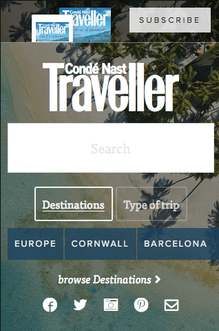
CONDÉ NAST TRAVELLER
CNTraveller’s whole site wasn’t mobile friendly so we were approached to completely re-design the site. This is the best project I’ve worked on as I was given the freedom to role with it, with an extended budget and timeline. We created a destination search on the homepage for users who knew exactly what they were…
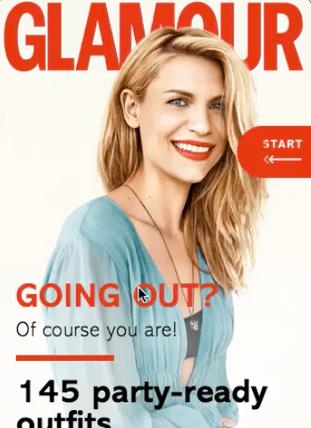
Glamour magazine app
The print editors of Glamour Magazine came to us to create an app so all Glamour magazine subscribers could view the content on their portable devices on the go. This was something new for us and was quite a challenge to create the CMS so the content could be easily uploaded every month. A lot…
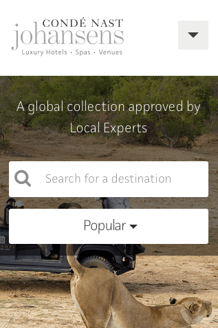
CONDÉ NAST JOHANSENS
The Johansens website was originally built just to host lists of hotels and properties with very little editorial content. They approached us asking for the funtionality to create full articles that would be mobile friendly. We gave them the ability to add multiple media types and choose from a variety of layouts to best suit the article type. This…
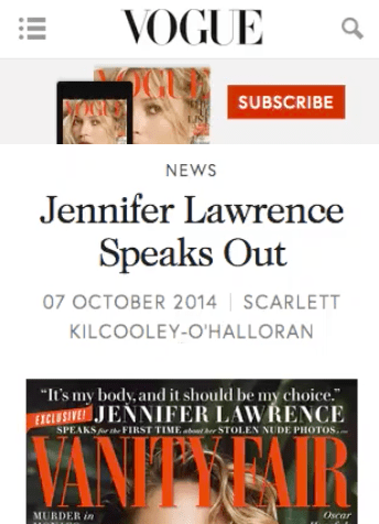
Vogue article template
Vogue wanted us to create article templates that were variable, beautifully designed, responsive and easy for the editors to use. We gave them the functionality to add multiple media types and choose from a variety of layouts to best suit the article type. This included a large gallery for more image-based articles, large quotes, smaller…
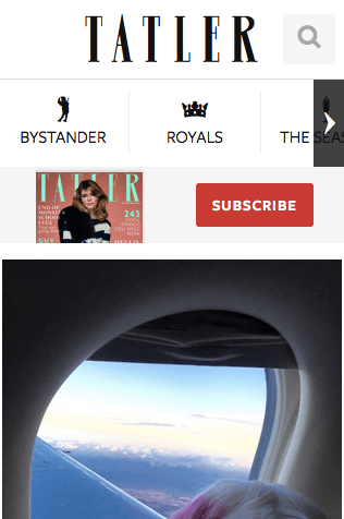
Tatler homepage
Tatler’s homepage wasn’t mobile friendly so they needed a total update. They asked us to create something very image focused with special Tatler-esque attributes. We designed a beautiful, bold responsive homepage with large galleries and a whole new navigation and space for responsive advertising. Their favourite feature was little pop up quotes you can see…

CNTRAVELLER SPA GUIDE
CNTraveller announced a partnership with Healing Holidays, who sponsor the coveted yearly spa awards in the CNTraveller magazine. We had to work to a strict deadline and worked with them to create a beautiful interactive spa guide that mirrored the magazine results. You are able to select the type of spa and location to narrow…
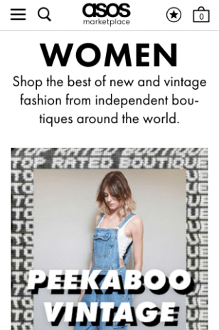
ASOS Marketplace
I was hired by ASOS to assist with the launch of ASOS Marketplace; an eBay style site for buying and selling clothes. After launch I created wireframes to improve the product pages, checkout and list pages. This was the first project I ever worked on and they gave me a huge amount of freedom to…
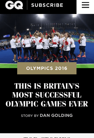
GQ-Magazine article pages
GQ wanted us to create article templates that were beautifully designed, responsive and easy for the editors to use. We gave them the functionality to add multiple media types and choose from a variety of layouts to best suit the article type. This included a large gallery for more image-based articles. The CMS system was…
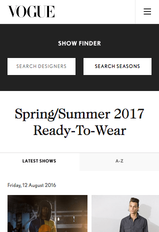
Vogue catwalk
Vogue’s catwalk pages are world famous and have a huge number of visitors. They asked us to improve the user journey, specifically the complexity of navigating all the different designers and seasons. We created new galleries with related galleries and designer / season dropdown as well as a new homepage with A-Z of designers and most recent & upcoming shows.…
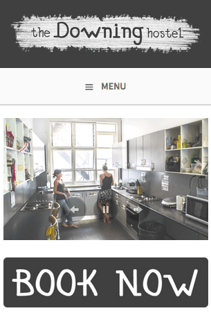
The Downing Hostel
The Downing Hostel asked me to design and build their website while I lived in Sydney. I created the logo and built the whole site. You can book directly from the website and it includes social media links for the hostel. It is entirely mobile friendly. The Downing Hostel homepage
 Katharine Humphries